This blog wasn’t designed with TED Talks and mainstage keynote presentations in mind as much as for ordinary people at the office; everyday presenters who want to pitch better, share ideas more clearly, and to make the most of their work.
In this post, we look at 5 easy rules to help you clean up your slides and create stunning decks that stand out and stick with the audience when you're done.

1 idea or message per slide
Got more ideas? Use more slides. It’s better to add a few extras and stick to the 1 idea rule than to cram everything into the same slide. Give your ideas space to breathe so they really stand out, and people can take them in.

2 fonts per presentation
Unless you’re a designer, don’t get cute with your fonts. Mixing incompatible font styles just make your deck look unprofessional. If you need some variation, try using bold, italic or different colors.

3 to 5 bullets at a time
Bullets can kill, and presentations are no exception. If you need to include a list, stick to 3, 4 or 5 points per slide. Need more? We suggest you either kill some darlings or start on a new slide.
Like this?

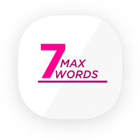
7 or less words per line
Long lines of text are hard to read. Stick to 7 words or less per line. This is a PowerPoint presentation, not a Word document.
Don't have the Pickit app yet? Click!

20 slides per presentation
This one isn’t law, but the idea is to keep it short and sweet. Guy Kawasaki says 10, but we think that's a little on the stingy side. This big idea: don't go adding extra slides unless you need them, or using filler slides that don’t add value to your presentation. As a general rule, 20 is plenty!
-Jul-27-2021-07-18-44-41-AM.png?width=1420&name=banner5@2x%20(1)-Jul-27-2021-07-18-44-41-AM.png)
Who wrote this?
This was posted by Brad Hawkes, our Content Marketing Manager here at Pickit. He's not a professor of rhetoric and he's never given a TED Talk. He has, however, clocked up over 1000 presentations, seminars and talks over the last 15 years, picking up a few ideas along the way. He once spoke to a crowd of 5000, but mostly he's spoken to crowds of 5, and he's always looking for simpler, clearer ways to say things and get a message across. He also makes a fine cup of coffee.